Slick Menu – Responsive WordPress Vertical Menu 1.5.6
Original price was: $14.99.$3.99Current price is: $3.99.

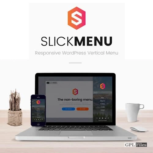
Slick Menu – Responsive WordPress Vertical Menu
Slick Menu is much more than just a menu plugin in its own right. It is possible to use it to construct an unlimited number of multi-level push menus or content sidebars that include rich content, a number of different styling options, and animation effects. Every level of the menu may be customised to include different background colors, graphics, overlays, patterns, videos, custom fonts, and a great deal more.
FEATURES
- Multiple levels of menus are supported by SlickNav Responsive Menu.
- Compatible with all browsers.
- able to use a keyboard.
- Degrades without JavaScript smoothly.
- makes a menu that complies with ARIA.
- Adding a search field is an option.
- choice to include a logo.
- Internationalized.
- Superior Filter.
- combine different menus.
Fully Responsive
Simply specify a mobile breakpoint in Slick Menu, and once the breakpoint is reached, your menu will become responsive on any screen size.
Unlimited Levels
Unlimited levels can be made. The stages will transition smoothly thanks to Slick Menu. Each level can override global settings and have its own options.
Background Images
Each of your levels can easily have background colours, graphics, and overlays with transparency choices added, creating a visually pleasing menu.
Background Videos
It is possible to use video backdrops with or without sound. Just type in the ID of your preferred YouTube video! Control the video’s opacity, repeat, start, and end settings.
Level Widths
If you want to display a full-width video, an image, or rich content using widgets and shortcodes, each Level can have a varied width.
Animations
Choose between overlapping or covering levels, 14 original menu appearance effects, and more than 45 animations that can be used to animate menu items.
Icons Library
Choose menu item icons from a variety of suppliers, including Dashicons, Elusive, Font Awesome, Foundation, Genericons, and image and SVG icons.
Scroll To Section
Excellent feature, particularly for single-page websites. Get a smooth scrolling to your anchored element by simply adding an anchor tag to your menu item.
Search Box
On the main menu level, you can quickly enable a global website search box and change its appearance and feel to your preference.
Social Networks
Add as many social networks as you like, then select a colour and an icon from the provided icon library for each network.
USAGE
The options may be accessed under Settings > SlickNav Menu on the dashboard.
- The original menu you want to use as a mobile menu must already be on the page.
- The default width for the menu is 600 pixels.
- The default menu label is MENU.
- Whether a parent link that has a submenu is clickable to a page is true or false for parent links.
- Show Child Links, defaulting to false
- Menu speed option for opening/closing
- Using the position fixed to body tag, fix the menu to the top.
- Smaller sizes, such 40 px in height and up to 140 px in width, perform better for the branding logo option next to the menu label.
- Option to disable the “.site-header” class on the header while the Slicknav menu is visible
- A search field might be included at the bottom of the menu.
- Background colour of the search icon
- Changeable opening and closing symbol options
- Slicknav values can be changed with an advanced filter at https://wpbeaches.com/slicknav-wordpress-filter-to-adjust-values/.
- Demo available at wpbeaches.com (resize browser window to below 600px)
Please be aware that Josh Cope is the author of the SlickNav jQuery plugin, but he is not in charge of its operation or maintenance.
DEVELOPER API
A theme creator, are you? You have total control over your menus thanks to the API. enables you to open, close, or toggle menus programmatically. Additionally, it will enable you to implement event listeners and carry out unique actions each time a menu or a particular level is active.
Related products
-
Sale

WPMU DEV Hustle 7.8.8
Original price was: $14.99.$3.99Current price is: $3.99. -
Sale
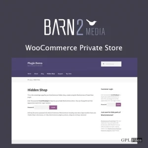
Barn2Media WooCommerce Private Store 1.8.1
Original price was: $14.99.$3.99Current price is: $3.99. -
Sale

WP Mail SMTP Pro 4.5.0
Original price was: $14.99.$3.99Current price is: $3.99. -
Sale
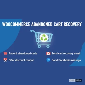
WooCommerce Abandoned Cart Recovery 1.1.4
Original price was: $14.99.$3.99Current price is: $3.99. -
Sale

Blog Manager for WordPress 2.01
Original price was: $14.99.$3.99Current price is: $3.99. -
Sale
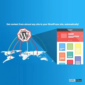
WP Content Crawler - Get content from almost any site, automatically! 1.12.0
Original price was: $14.99.$3.99Current price is: $3.99. -
Sale
JetWooBuilder For Elementor 2.2.3
Original price was: $14.99.$3.99Current price is: $3.99. -
Sale

Contact us all-in-one button with callback request feature for WordPress 2.2.4
Original price was: $14.99.$3.99Current price is: $3.99.