
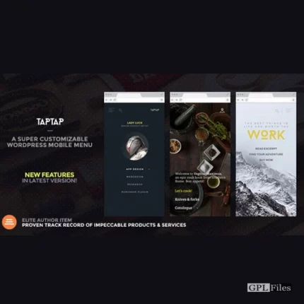
TapTap : A Super Customizable WordPress Mobile Menu
With TapTap, our goal was to develop a responsive, mobile-first, off-canvas menu plugin for WordPress that is user-friendly, easy to edit, and off-canvas. This plugin should be flexible enough to be implemented on virtually any website.
Whether you’re building a portfolio for your creative work or a website for your company, the ability to mix and match fonts, font sizes, icons, letter spacing, colours, button and logo positions, backgrounds, alignments, animation speeds, and other design elements enables you to rapidly create a responsive menu that is distinctively yours. Put pre-determined layouts out of your mind and create the mobile menu you want instead. You can now personalise your new menu in record time and with no effort, all while viewing the results of any changes you make in real time.
Features
TapTap is without a doubt the most adaptable WordPress mobile menu that can be found anywhere online. It offers a wide range of customization options. Please have a look at the full details on TapTap’s nearly limitless possibilities below in order to become familiar with everything that can be edited, added, and customised by using the app.
Menu Button
- Place the menu button to the left or right, then make minute adjustments to the top-to-side distance with per-pixel precision.
- To open the menu, click or tap it, or move your cursor over it.
- 6 different menu button styles
- Variations of each type include regular and thin widths (12 designs total)
- There are two distinct animations associated with each button (or no animation at all)
- Adjust the animation speed to suit your needs.
- Adjust the level of opacity for the button.
- Color, hover colour, and additional colours when the menu is active can all be customised.
- Add label to menu button
- Enter custom label text
- Position label anywhere around the button with per-pixel accuracy
- Set custom font size
- Set custom letter spacing
- Select label font (12 options available, or use a theme font)
- If menu button is hidden, label will remain visible (if one is entered) and can be used to activate the menu
- Customize label color, hover color
- Hide the menu button if you like (this is important if you want to use a custom element to activate the menu). Hiding the button is optional.
Logo Placement
- Place the logo to the left, the centre, or the right, and then adjust the top and side distances with per-pixel precision.
- If logo entered as text:
- Set custom font size
- Set custom letter spacing
- Select logo font (12 options available, or use a theme font)
- Customize color, hover color
- If logo entered as an image:
- Set custom logo image size
- Optionally hide logo placement
WooCommerce Cart Button
- Adjust the location of the WooCommerce button to the left or right, then use per-pixel precision to adjust the spacing between the top and side.
- Variations on the icons for the shopping cart and the shopping bag
- Modify the hues and the colour used for hovering.
Search Button
- Place the search button to the left or right, and then adjust the top-to-side distance with per-pixel precision.
- There are variations of the search button between regular and thin.
- To see additional possibilities, you can use the search button’s toggle.
- Change the colours and the hue of the hover.
- Make sure the search button has a label.
- Enter custom label text
- Accuracy down to the per-pixel level is required for placing the label anywhere around the button.
- Size of the typeface can be customised.
- Adjust the letter spacing to your liking.
- Select label font (12 options available, or use a theme font)
- In the event that the search button is hidden, the label will continue to be displayed (if one has been entered), and it can be used to trigger the search function.
- Customize label colour, hover colour
- You have the option of hiding the search button (and the function along with it)
Search Function
- Change the default speed of appearance animations.
- Field for searching:
- Change the text that appears in the search field placeholders.
- Adjust the height of the search field as needed.
- Text in search fields should be aligned to the right to enable RTL.
- Option to hide the “clear field”
- Size of the typeface can be customised.
- Adjust the letter spacing to your liking.
- Select label font (12 options available, or use a theme font)
- Adjust the transparency of the search field’s background.
- You can change the colours of the search field backdrop, the placeholder text, the search text, and the buttons to dismiss and empty the field.
- Adjust the opacity and colour of the background overlay.
Header
- Show/hide header
- Set custom header height
- Change header background color
- Change header background opacity
- Show/hide header background shadow (+ set shadow strength)
Menu Container, Menu, Widgets etc.
- General:
- You have the option of displaying the menu fly-out as a full screen or setting the width and height manually.
- When the menu is configured to animate from top to bottom, height becomes relevant.
- When the menu is configured to animate from left to right, width becomes relevant.
- Adjust the menu so that it slides in from the left, right, top, or bottom, or fades in gradually.
- Change the rate at which menus appear to suit your needs.
- Display of the submenu is optional when the current (have menus open when on current menu item)
- After selecting an item from the menu, you have the option to close the menu (useful on one-page websites)
- Align the contents of the menu to the left, centre, and right, as well as the top, middle, and bottom.
- Provide the maximum width for content that is contained within the menu container.
- Modify the scaling animation of the menu contents (any scaling level, positive or negative, or disable altogether).
- Padding options for the left, right, top, and bottom of the menu container can be customised.
- If you are using a desktop computer, using the ESC button will close both the menu and the search.
- You can change the colour and opacity of the menu’s backdrop overlay.
- You have the option of displaying the menu fly-out as a full screen or setting the width and height manually.
- Background
- Add background image or pattern
- Control corner roundness and distance from screen edges
- Change background image positioning
- Change background image opacity
- Change background color
- Change background color opacity
- Create animated, pulsating or gradient color backgrounds (+ change animation speed)
- Add heading, subheading texts:
- Change fonts (12 options available, or use a theme font)
- Change font sizes
- Change letter spacings
- Change line heights
- Turn heading texts into links
- Add heading image:
- Set maximum size
- Turn heading image into a link
- Set top and bottom margins
- Accordion menu
- Build a multi-level menu (no depth limit)
- Add descriptions to single-level menu items
- Adjust the vertical distance between the menu items and their respective descriptions.
- Alter the font size (12 options available, or use a theme font)
- Modify the size of the typeface.
- Change letter spacings
- Adjust the line heights.
- Alter all of the hues.
- The top-level items, the sublevel items, and the menu descriptions each have their own specific settings for the font selections.
- Include images in the menu items:
- 600+ icons available
- Modify the size of the icon (separately for top-level and submenu items)
- Modify the colour of the icon (separately for top-level and submenu items)
- Widget locations
- Widget locations above as well as below the menu
- Text widget accepts shortcodes
- Select fonts (12 options available, or use a theme font)
- Set custom font sizes
- Set custom letter spacing
- Set custom line heights
- Change colors (titles, content, links)
- Set font settings individually for widget titles and content
Experimental Image-based Menu
Note that when it is employed, the image-based menu layout can function either in place of or in addition to the primary menu depending on your preferences. Both the main menu and the image-based menu have their own unique sets of options, so changing one will not affect the other.
- Alter all of the hues.
- Modify the squareness of the corners.
- Allows for an unlimited number of submenus and up to nine top-level items.
- In the “Image-based Menu” area, you can upload primary images and adjust several other options.
Reviews
There are no reviews yet.