
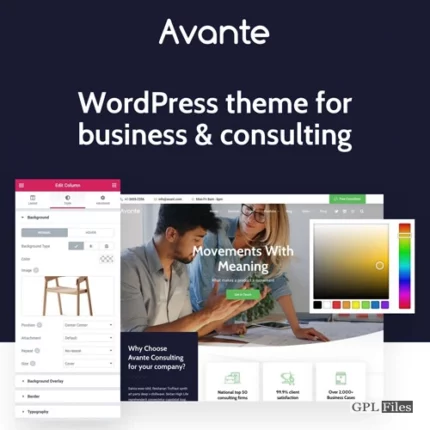
Avante | Business Consulting WordPress
9 homepages for consultancy, financial, corporate, and other business websites
We developed homepages that are already formatted for usage specifically for websites pertaining to consulting, financial, corporate, and other broad business-related topics. In subsequent updates, you can expect to see even more new content added.
20+ Flexible Portfolio, Video & Gallery Layouts
Create a one-of-a-kind presentation of the media material on your site, such as your portfolio, videos, or photographs, by making use of a number of video, gallery, and slider layouts.
- Template for use in predesigning pages, portfolios, video galleries, and other galleries, etc. to provide you with the ability to exhibit your business, portfolio, galleries, and videos in a distinctive manner while requiring a minimal number of steps to develop with an intuitive page builder.
- The portfolio is an excellent approach to demonstrate the work that your company has done.
- Slider The slider is an excellent tool for displaying highlighted material on a page. It has a one-of-a-kind and breathtaking motion that can be quickly constructed without the need for any scripting.
- You may quickly add many photographs into a gallery, which makes it a convenient method to display groupings of pictures on your website. Gallery
- Video Gallery The Video Gallery is a wonderful method to exhibit groups of video contents on your website, making it simple for your followers to experience rich media material directly from your website or via YouTube.
- Text, images, and videos may all be shown on a page, which displays information about your company, a booking calendar, services, and other relevant information on your website.
- You may import any of the fifty plus predefined page templates that are included with the Elementor page builder.
- 8 blog themes to choose from Multiple layouts for a single blog post provide you tremendous options to employ for a variety of different applications. Post material can be shown with photographs, gallery slider shows, or videos from other sources, such as YouTube, Vimeo, or self-hosted videos, depending on the user’s preference. Additionally, blog posts may handle a variety of content types, such as photos, galleries, videos, and so on.
- You can quickly make your own menu design with the help of these 5 Traditional Menu Layouts, which come with a variety of menu layouts and numerous choices for personalization.
Elementor Page Builder offers fully customizable header, navigation, mega menu, and footer.
Easiest to use Elementor Page Builder
- Simple and Straightforward Page Editor We are utilising “Elementor,” the WordPress page builder that is the easiest to use. In order for you to have pleasure in constructing beautiful sites using the drag-and-drop interface.
- The ability to add and manage content visually When you pick contents to add to a page, rather than presenting an icon, it displays a visual snapshot of the selected material.
- Preview that is responsive to user input. Within the page builder, you can immediately view and work with a responsive layout.
- Drag & Drop Content Builder By dragging and dropping our many pre-defined content modules like as galleries, blogs, maps, and other elements, you can create several layouts on a single page without having to modify the theme code. Let’s put the robust page builder to the test.
- Download and use as a model. A page can be stored as a template to use for creating other pages in the future. This reduces the amount of time spent developing new gallery pages.
Fully integrated with WordPress Customizer
- Fully integrated with the WordPress Customizer View a live preview while you make changes to the Appearance settings. You will see the consequences immediately of any changes you make to the elements’ colours, backgrounds, typography, layout style, text, or photos, regardless of what you modify.
- Create a website that can simply adapt to different screen sizes. With just one click in the Live Customizer, you can present the findings in a view that is responsive across several devices, such as computers, tablets, and mobile phones.
- Typography with Live Previewing Capabilities Over five hundred and fifty or more Google Fonts are provided with each style, and any changes you make to a font will be reflected in real time when you use the Customizer. You won’t even need to touch the code to alter the size of the font, the style, or the colour.
- Comprehensive Management of Advanced Fonts We support a wide variety of Google Fonts, as well as Typekit and self-hosted fonts, which enables you to submit your own font without the need for any other plugins.
- A variety of typographic options, including Main Content Font Family, Main Content Font Size, H1-H6 Font Family, H1-H6 Font Weight, and H1-H6 Font Size, may be changed with ease.
- Modify the button’s font family with ease.
- You should also easily adjust the typography of the Menu Font Family, Menu Font Size, Menu Padding, Menu Font Weight, Menu Font Spacing, and Menu Font Text Transform to be different from one another.
- Additionally, it is simple to adjust the SubMenu Font Size, the SubMenu Font Weight, the SubMenu Font Spacing, and the SubMenu Text Transform (None, Uppercase, Lowercase, and Capitalize).
- Easily adjust the Side Menu Font Family, Side Menu Font Size, Side Menu Font Spacing, and Side Menu Text Transform by making the appropriate adjustments (None, Uppercase, Lowercase, and Capitalize).
- In addition, it is simple to adjust the Page Header Padding Top and Page Header Padding Bottom, as well as the Page Title Font Size, Page Title Font Weight, Page Title Font Spacing, and Page Title Text Transform (None, Uppercase, Lowercase, Capitalize)
- Changes to the Content Builder Header Font Size and Content Builder Header Text Transform may also be made quickly and simply (None, Uppercase, Lowercase, Capitalize)
- In addition, it is simple to adjust the font size of the page title, as well as the font weight and spacing of the page tagline, as well as the text transform of the page tagline (None, Uppercase, Lowercase, Capitalize)
- Not least, the Widget Title Font Family, Widget Title Font Size, Widget Title Font Weight, Widget Title Font Spacing, and Widget Title Text Transform may all be readily modified (None, Uppercase, Lowercase, and Capitalize).
- Protection Options for Galleries and Images The theme provides a number of different protection mechanisms for your works, such as a password-protected option, right-click protection, picture dragging protection, and a watermark.
- Incredible Visuals to Accompany The ability to quickly apply pictures, patterns, and colours to the backdrop of your website. Additionally, a wide variety of repetition choices can be made.
- It is simple to change the background colour of the Main Content Background Color, as well as the Background Color of Input and Textarea, and the Background Color of Buttons.
- In addition, you may customise the backdrop by changing the Menu Background Color, the Menu Background Image, the Menu Background Repeat, the Menu Background Size, the Menu Background Attachment, and the Menu Background Position.
- You may also easily adjust the background colour of the Sub Menu Hover State and the background colour of the Sub Menu itself.
- Additionally, the colour of the background of the top bar may be changed with ease.
- Altering the Side Menu Background Color, Side Menu Background Image, Side Menu Background Repeat, Side Menu Background Size, Side Menu Background Attachment, and Side Menu Background Position is as easy as changing the colour of the background.
- Additionally, the background colour of the search input may be simply changed.
- In addition, it is simple to change the background colour of the page header, the background colour of the footer, the image of the footer background, the number of times the footer background repeats itself, the size of the footer background attachment, and the position of the footer background.
- Infinite Variety of Colors Utilizing the colour picker, you can easily adjust the colours of the elements on your website.
- Modify the Main Content Background Color, Page Content Font Color, Page Content Link Color, Page Content Hover Link Color, H1-H6 Font Color, and Horizontal Line Color so that they are different colours.
- It is simple to set the various colours used for the Input and Textarea. Background Color, the Color of the Input and Textarea Font, the Color of the Input and Textarea Border, the Color of the Input and Textarea Focus State, the Color of the Button Background, the Color of the Button Font, and the Color of the Button Border.
- Additionally, changing the colour of the frame is simple.
- In addition, just select a colour that is not the same as the one you want to use for the Menu Background Color, Menu Font Color, Menu Hover State Font Color, Menu Active State Font Color, and Menu Bar Border Color.
- Also, other aspects of the submenu’s appearance may be customised, including its font colour, hover state font colour, background colour for the hover state, background colour for the submenu itself, and border colour for the submenu.
- Modify the colour of the font used in the Mega Menu Header and the colour of the border around the Mega Menu with ease.
- The colour of the top bar’s background and the font colour of the top bar menu are both simply modifiable.
- You may also simply alter the colour of the side menu background, the colour of the side menu font, and the colour of the side menu hover state font.
- Modify the colour of the search input background as well as the colour of the search input font with ease.
- Modify the colour of the page header background, the font colour of the page title, and the font colour of the page tagline.
- Change the colour of the Sidebar Font, Sidebar Link, and Sidebar Hover Link, as well as the Font Color of the Sidebar Widget Title, with ease.
- Change the colour of the Page Footer background, the colour of the Footer font, the colour of the Footer link, the colour of the Footer Hover Link, the colour of the Footer border, and the colour of the Footer social icon easily.
- Design That Is Responsive Every page, regardless of whether it is viewed on a laptop, tablet, or mobile phone, has been created with the behaviour of users as the primary emphasis and is optimised to look fantastic on all platforms. In the event that you decide you no longer want the responsive functionality, all that is required of you in the live customizer backend is a single click.
- One click is all that is required to activate the frame feature for the site layout. In addition, you may select the colour of the frame with ease using the colour picker.
- Social Cooperation Cooperation One click is all that is required to add a Social Button to any and all pages.
- Content.
- A variety of typographic options, including Main Content Font Family, Main Content Font Size, H1-H6 Font Family, H1-H6 Font Weight, and H1-H6 Font Size, may be changed with ease.
- You may also simply adjust the background colour of the Main Content, the font colour of the page content, the colour of the page content links, the colour of the page content hover links, the colour of the H1-H6 font, and the colour of the horizontal line.
- Alter the colour of the input and textarea backgrounds, the font colour of the input and textarea backgrounds, the border colour of the input and textarea backgrounds, the focus state colour of the input and textarea backgrounds, and the button background colour, font colour, and border colour.
Navigation
Formatting of the Menu in General There are many other menu layout choices to select from, such as Left Align, Center Align, Left Vertical, Hamburger Menu + Open Side Menu, and Hamburger Menu (Off-Canvas Side Menu Navigation) + Open Fullscreen Menu.
Using the drag-and-drop functionality of the Elementor page builder, you can create unique and detailed layouts for your main menu and header. You don’t even need to know how to code!
Sticky Menu When scrolling, you only need to make one click to access the fixed main menu. In addition, a Light and Dark Sticky Menu Color Scheme is included so that your website may be customised to reflect your personal taste.
Utilizing Elementor Page Builder, you are able to fully personalise the menu’s layout, columns, and contents.
Typography
Changes may be made quickly and easily to the Menu Font Family, Menu Font Size, Menu Padding, Menu Font Weight, Menu Font Spacing, and Menu Font Text Transform.
Colors
Easily modify the colour of the menu font, the colour of the menu font while it is in the hover state, the colour of the menu font when it is active, and the colour of the menu bar border.
Backgrounds
A variety of backgrounds may be easily customised, including the Menu Background Color, Menu Background Image, Menu Background Repeat, Menu Background Size, Menu Background Attachment, and Menu Background Position.
The SubMenu Font Size, SubMenu Font Weight, SubMenu Font Spacing, SubMenu Font Text Transform, SubMenu Font Color, Sub Menu Hover State Font Color, Sub Menu Hover State Background Color, Sub Menu Background Color, and Sub Menu Border Color are all configurable options for the SubMenu Submenu.
The Mega Menu Theme has mega menu functionality, allowing you to organise a huge number of menu items and show navigation links in columns. This is useful if you have a lot of menu items.
You can easily change the colour of the Mega Menu Header Font and the Mega Menu Border by using the colour picker.
Using the drag-and-drop functionality of the Elementor page builder, you may assemble unique and detailed items for your mega menu. You don’t even need to know how to code!
The Best Bar
The Top Bar will appear directly above the main menu with only one click of the mouse.
In addition, the colour of the top bar background and the colour of the top bar menu font may both be simply adjusted.
Information Regarding Contact You have the ability to set both the Contact Hours and the Contact Phone Number. In addition, the Top Bar Social Icons link may be opened in a new window with only one click of the mouse.
Side Menu
To activate the Side Menu on Desktop, all that is necessary is a single click.
By using the colour picker, you can quickly alter the Side Menu Background Color, Side Menu Font Color, and Side Menu Hover State Font Color.
Simply go through the picture library to quickly set the background image for the side menu.
In addition, Background Repeat, Background Size, Background Attachment, and Background Position may all be easily altered with a simple click of the mouse.
Alter the Side Menu Font Family, Side Menu Font Size, and Side Menu Font Text Transform at the click of a button (None, Uppercase, Lowercase, Capitalize)
Header \sBackground
When scrolling past the header background picture, you only need to click once to trigger the blur effect and make it visible.
Use the colour picker to quickly alter the background colour of the page header.
Modify the Page Header Padding Top and Page Header Padding Bottom with ease, as well as the Page Title Font Size, Page Title Font Weight, Page Title Font Spacing, and Page Title Text Transform (None, Uppercase, Lowercase, Capitalize)
Change the colour of the font used for the page title using the colour picker easily.
Title of the Page with an Image Serving as the Background
Simply alter the background image to modify the page title. Height expressed as a percentage
Page Tagline & Sub Title
Use the colour picker to quickly alter the font colour of the page tagline.
In addition, it is simple to adjust the font size of the page title, as well as the font weight and spacing of the page tagline, and the page tagline itself. Alteration of the Text (None, Uppercase, Lowercase, Capitalize)
Sidebar \sTypography
Simple to adapt. Font Family for the Widget Title, Widget Title Font Size, Font Weight for the Widget Title, Font Spacing for the Widget Title, and Widget Title Text Transform (None, Uppercase, Lowercase, Capitalize)
Color
Simple to adapt. By using the colour picker, you may change the Sidebar Font Color, Sidebar Link Color, Sidebar Hover Link Color, and Sidebar Widget Title Font Color.
Footer
Using the drag-and-drop functionality of the Elementor page builder, you can create unique and rich footer layouts. You don’t even need to know how to code!
General
Simple configuration options for Footer Sidebar Columns, allowing you to hide the Footer Sidebar or 1-4 columns.
It only takes one click to activate the option that will open the links to the social icons in the footer in a new window.
Background
Simple to adapt. Choose the background colour for the page footer using the colour picker.
Just make the necessary adjustments to the Footer Background Repeat, Footer Background Size, Footer Background Attachment, and Footer Background Position settings.
Simple configuration of the Footer Background Image via simple image surfing.
Using the colour picker, you can easily alter the colour of the footer font, the colour of the footer links, the colour of the footer hover links, the colour of the footer border, and the colour of the footer social icon.
Copyright
Simply insert your Copyright Text, as well as pick the Content for the Copyright Right Area (Social Icons, Footer Menu)
When scrolling, only one click is needed to activate the “go to top” button that is located at the bottom of the page.
Gallery
General
You may quickly arrange the photographs in a gallery by selecting one of the many available choices, such as “by drag and drop,” “by newest,” “by oldest,” “by random,” and “by title.”
Display picture information in a straightforward manner for photo editing pages. You have the option of selecting a piece of information from this list, which includes the WordPress Media ID, File Name, and Image Title.
Selecting the layout columns option for picture proofing pages may be done with little effort.
Lightbox
There are two different colour skins that may be applied to the lightbox (White & Black)
It is simple to align the lightbox thumbnails in either the horizontal or the vertical orientation.
In this customizer, you may easily alter the lightbox overlay’s level of transparency.
When using the lightbox mode, you just need to click once for the picture description to appear beneath the image.
Archive
The slideshow effect that plays automatically when the mouse is moved over a gallery thumbnail may be activated with just one click.
Fullscreen
It only takes one click to activate the full-screen slideshow when it automatically begins playing, activate the full-screen slideshow so that images are displayed in a random order, enable the display of the slideshow’s image caption, activate the display of slide images in proportion to the screen size without covering it up, and activate the display of slide navigation arrows.
Adjusting the number of milliseconds for the transition between each image and the number of seconds for the full-screen slideshow timer is simple.
Choose from a variety of transition options for the contents of the full-screen slideshow.
Blog General To allow the display of the entire content of posts on the blog page, you just need to click on it once (excerpt blog grid layout)
It is simple to modify the layout of the page in order to display the archive page, category page, or tag page (Grid, Grid + Right Sidebar, Grid + Left Sidebar, Right Sidebar, and full width).
Use the colour picker to quickly alter the font colour of the post category link.
Slider To activate the display of the slider in blog pages, you only need to click the button once.
Modify the post layout for sliders with ease (Full width, 3 columns), as well as the post category filter for sliders and slider post items.
Single Post
The display of the featured image as the post header background, the display of the featured content (image or gallery) in the single post page, the display of post tags on the single post page, the display of about the author on the single post page, the display of related posts on the single post page content, and the display of sharing buttons on the single post page content can all be enabled with just a single click.
Shop Layout You are able to easily alter the page layout for displaying your shop’s products (Fullwidth, with sidebar), as well as the amount of product items that you want to display on each page.
Single Product Use the colour picker to quickly and easily alter the text colour of the product pricing.
On a single product page, displaying similar goods requires only one click rather than many clicks.
Menus You may easily construct your own with 24 different choices already established. Additionally, the parts of the header sections should be rearranged, the location of the logo should be altered, the colours should be changed, and an image, social icons, taglines, and supplementary top menus should be applied.
General Easily configure a variety of different fonts, including Menu Font Family, Menu Font Size, Menu Padding, Menu Font Weight, Menu Font Spacing, Menu Font Text Transform, Side Menu Font Spacing, and so forth.
In addition to that, you can easily customise the backdrop by changing the Menu Background Color, Menu Background Image, Menu Background Repeat, Menu Background Size, Menu Background Attachment, and Menu Background Position.
The Primary Menu, Top Bar Menu, Side (Mobile) Menu, and Footer Menu are the four different menus that are supported by the Menu Locations Theme. You have the ability to choose which menu is displayed in each location, and you can even insert menus into widget areas by using the custom menu widget.
Easily arrange the order of submenus by dragging and dropping them as the following menu.
Features Menu
Main Menu
One Page Menu
Side Mobile Menu Widgets We made your life simpler by providing a wide range of custom widgets, such as Custom Category Posts, Custom Flickr, Custom Instagram, Custom Map, Custom Menu, Custom Popular Posts, Custom Recent Posts, Custom Social Profiles, and Custom Twitter. Simply activate and customise your own widgets by dragging and dropping them into any sidebars you make.
Front Page That Doesn’t Change
You may easily pick the choices of the Front page to display a static page or your most recent posts, and you can also apply the front page and the posts page to a certain page.
Amazing Choices for Pages and Posts
The Page Options may be found in the same menu as the Theme Options. Page choices allow you to customise the value of each particular page or post, and the changes you make there will reflect on the page or post you made them on. These will take precedence over the theme choices, which provide you the ability to create a page or post that is distinct from the global settings. You are able to design fantastic websites using these many options since they all operate together.
Post Options
Configure the layout of the page that displays a single post, including Fullwidth, with left sidebar, with right sidebar, and split screen.
Indicate the featured content type for the post, which may be a picture, a gallery, a video from YouTube or Vimeo, or all of the above. On each individual post page, a different sort of material will be displayed.
Please specify the format, which may be Standard, Link, or Quote.
Include Photography, Lifestyle, Travel, and Any Other Categories You Want, Including “Uncategorized.”
Include a number of tags, the featured picture, the excerpt, and the shortcode.
Simple administration of tags and categories.
Page Options
With only one click, you can make the main menu see-through and also conceal the header by default on the page.
Page Tagline is accessible (HTML code also supports)
Choose from the available page templates to specify the sidebar for the page.
Modify the menu on the website if you want the page’s main menu to look different than the one that is displayed by default.
You will need to provide the parent page, the template for the page, and the ordering.
Specify the featured image, as well as the accompanying commentary.
Magnificent Choices in the Gallery The theme has a variety of gallery template layouts that may be used for a variety of purposes. You have the option of displaying a full-screen slideshow, horizontal, justified, masonry, or traditional gallery columns, or even a combination of several gallery layouts.
Unlimited Number of Pages for Your Photo Gallery
Please provide the password to access the gallery.
Support Image shown together with accompanying commentary.
Amazing Alternatives for Blogs
There are 8 different page layouts available to pick from, and the post kinds accessible include picture, gallery, Vimeo Video, and YouTube Video.
Automatic pagination.
Sharing box on the post, complete with social iconography.
Comments organised into threads
Page that profiles the author.
Custom Sidebars Create your own unique sidebars quickly and easily without having to touch any code. In addition, just configure the various sidebars so that they are an exact fit for each page.
Unlimited sidebar Make sure that each of your pages has a sidebar, and pick it.
Support for Navigation on a Single Page Utilizing a drag-and-drop builder with a bespoke menu system, you can quickly and easily construct a modern one-page site or micro site.
Sharp Icons of the Font Icons of the font are always perfectly clear and look great on screens of any size or resolution, regardless of the device. In addition to this, the use of typeface icons might assist to accelerate the loading speeds of your website.
Ready for the Retina Display Make sure that your photographs and other components seem beautiful and crisp on monitors with a Retina or a high resolution.
Compatibility optimization for use on Google mobile devices Check The results of mobile visitors’ searches conducted on your website using Google will be more apparent and will have improved performance. Google has made changes to its search algorithm, giving precedence in results to websites that are better suited for optimal display on mobile and portable devices.
The Search Engine Optimization (SEO) Theme is constructed using semantic HTML code and CSS, making it simple for search engines to crawl and index your website.
Fully Adaptable to Your Needs With the help of our adaptable foundation, we were able to design a robust theme that can showcase a variety of great portfolios and photographic possibilities, such as full-screen images and slide shows, amongst other things. It should come as no surprise that no two iterations of the theme will ever look exactly the same.
Multiple photos upload This theme comes with an extensive gallery editor that allows for the uploading of several photos at once as well as the reordering of those images through drag and drop.
The Translation Support Theme comes with both.mo and.po language files already installed. Additionally, the WPML plugin is compatible with the theme, which makes it possible for you to convert your website into any language or many languages.
Other
- Compatible with the most recent release of WordPress
- Constructed with HTML5 and CSS3
- Improvements Made to jQuery
- For improved overall speed, JavaScript source files are automatically merged and minified.
- Testing was done on WordPress Multisite (WPMU).
- Enhanced for SEO, with a solid SEO foundation already incorporated (compatible with SEO Plugins like Yoast)
- Code that is well organised, commented on, and clean
- 100% Responsive Theme, and it can be turned on or off with the click of a button.
- Updater That Is Automatic For Themes
- Font icons are used for both social and theme icons; there are no images used.
- CSS3 animations enable or deactivate on desktop/mobile
- CSS and javascript compression support
- CSS3 Animations CSS3 animations allow you to set the type, direction, and speed of components, which helps to focus the attention of your visitors towards the material you have on your site.
- Support for child themes, allowing for more in-depth customisation that is unaffected by the theme’s subsequent updates.
- Built using the WordPress community’s standard best practises.
Customer Support
- Once you have made your purchase, you will have access to our advanced support ticket system, where you will be able to receive professional support from our experienced and dedicated support team. This will ensure that you and your business always have the assistance you and it require, precisely when it requires it the most.
- There is documentation available both online and offline.
- Free Updates to the Theme – The quality of our themes is now being worked on to be improved by the addition of new features and the elimination of problems.
- Comments and suggestions from users are always appreciated for upcoming features.
Reviews
There are no reviews yet.