
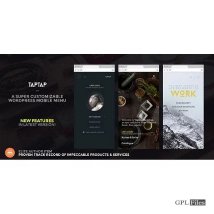
TapTap Super Mobile Menu
You can rapidly construct a responsive menu that is specifically you by combining fonts, font sizes, icons, letter spacing, colours, button and logo locations, backgrounds, alignments, animation speeds, etc., whether you’re designing a menu for a creative portfolio or a business website. Forget pre-established designs, and create the mobile menu you like. You may now more quickly and easily modify your new menu by previewing any changes you make in real time.
Please read the list of features below and take a look at the live samples on the demo site here to get the whole scoop on TapTap.
PS: The WordPress Mobile Menu Bundle includes TapTap at a discounted price.
Features
The most adaptable WordPress mobile menu accessible anywhere, TapTap is incredibly configurable. Please review the whole information on TapTap’s virtually limitless possibilities below to familiarise yourself with everything you can modify, add, and customise.
Menu Button
- Place the menu button to the left or right, then use pixel accuracy to fine-tune the top/side distance.
- Using a mouseover, click, or tap to open a menu
- Six distinct menu button designs
- There are standard and thin versions of each style (12 designs total)
- Every button features two distinct animations (or no animation at all)
- Customize the animation speed
- The opacity of a button.
- Customise colour, hover colour, and add additional colours while menu is active
- Give the menu button a label.
- Input your own label wording.
- With per-pixel accuracy, position the label anywhere around the button.
- Customize the font size
- Customize the letter spacing
- choosing a label font (12 options available, or use a theme font)
- If the menu button is hidden, the label, which can be used to activate the menu, will still be displayed.
- Label and hover colour customization
- You can choose to hide the menu button (helpful if you want to activate the menu using a custom element).
Logo Placement
- Place the logo to the left, centre, or right, and then adjust the top and side distances with pixel-level precision.
- If the logo is typed in text:
- Customize the font size
- Customize the letter spacing
- Choosing a logo font (12 options available, or use a theme font)
- Adapt colour and hover colour
- If a logo is used, the image
- choose a certain logo size
- The option to conceal logo placement
WooCommerce Cart Button
- Place the WooCommerce button left or right, then precisely adjust the top/side distance with each pixel.
- several shopping bag and cart icons
- change the colour of the hover-over
Search Button
- Place the search button to the left or right, then use pixel accuracy to adjust the top/side distance.
- variants of the regular and thin search buttons
- You can choose to rotate the search button to see more options.
- Adapt colour and hover colour
- Give the search button a label.
- Input your own label wording.
- With per-pixel accuracy, position the label anywhere around the button.
- Customize the font size
- Customize the letter spacing
- Choosing a label font (12 options available, or use a theme font)
- If the search button is hidden, the label (if one is entered) will still be displayed and can be used to launch the search feature.
- Label and hover colour customization
- hide the search button if desired (and the function along with it)
Search Function
- Adjust the speed of the appearance animation.
- search engine
- Put your own placeholder text in the search field.
- Adapt search field height
- Align searchfield text to the right for RTL support.
- Remove the “clear field” option
- Customize the font size
- Customize the letter spacing
- Choosing a label font (12 options available, or use a theme font)
- Opacify the background of the search field.
- Customize the background, placeholder, search text, close, and “clear field” colours of the search field.
- The colour and opacity of the background overlay
Header
- Header visibility
- Customize the header height
- Header background colour change
- change the opacity of the header background
- Show or conceal the header background shadow and increase the shadow intensity
Horizontal Menu
The settings for the horizontal menu are unique and will be created independently.
- Section headings
- Adapt font and icon sizes
- Adjust all the hues
Experimental Image-based Menu
Please take note that when utilised, the image-based menu style may be utilised in addition to or in instead of the regular menu. The main menu’s settings do not apply to the image-based menu’s settings, and vice versa.
- Adjust all the hues
- Modify the corner roundness
- Supports limitless submenus options and up to nine top-level items.
- Change other settings in the “Image-based Menu” section after uploading the primary images.

Jack (verified owner) –