
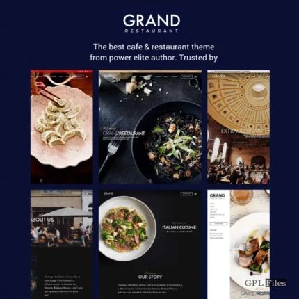
Grand Restaurant Cafe WordPress Theme
The Grand Restaurant Wordpress Theme is a fresh and current option for cafes, restaurants, and any other kind of food-related company website. Built with the most recent version of the Wordpress technology. The responsive layout that Grand Restaurant supports ensures that the website appears fantastic on all devices. It features predetermined styling for contemporary cuisine restaurants, oriental cuisine restaurants, and elegant cuisine restaurants, all of which can be imported with only one click.
Features
Make Money out of your online menu
- WooCommerce Using the WooCommerce Plugin, you can get your food delivery service up and running in no time. We support payments made both online and offline in their various forms.
- Each menu will have support for the Direct Purchase Link option. Your online sales will increase if you provide your consumers with a link to a direct purchase page for each menu item they select. Customers only need to click the “purchase” link that is located on each menu item that they wish to order.
Display Your Restaurant Professionally
- Inspiration for Food Menu Layouts We offered various formats for displaying the food menu, including some that were inspired by traditional food menus and could be seen, via the link supplied, at genuine restaurants.
- Style similar to Google Maps and Multiple Locations Changing the colour palette of Google Maps is simple when you use the styling from snazzymaps. Additionally, this theme offers support for a multitude of maps and places.
- Options for Reservations We offered a variety of convenient ways to make reservations, such as through our email form, a personalised URL, or OpenTable.
Various Options for getting started
- Incredible Six Predefined Demos Available With one of our pre-defined six samples, you may have your website up and running in a short amount of time.
- Importing Demo Content Requires Just One Click Only Importing our demo content, which includes pages, posts, sliders, widgets, theme options, and other settings, can be accomplished with a single click and is done in a manner that is both speedy and simple.
- 6 blog themes to choose from Multiple layouts for a single blog post provide you powerful options to employ for a variety of different applications. Post material can be shown with photographs, gallery slider shows, or videos from other sources, such as YouTube, Vimeo, or self-hosted videos, depending on the user’s preference. Additionally, blog posts can handle a variety of multimedia formats, such as photos, galleries, videos, soundcloud, and so on.
- You can quickly construct your own menu design with the help of these three menu layouts, each of which comes with three different menu styles and a variety of settings that may be customised.
- You can easily construct a contact page with the help of these 4 Contact Templates, which come with a variety of different layouts for contact forms, google maps, and design.
- Combining Boxed and Wide Layout Selecting the boxed or wide layout in the live customizer is a breeze, and the instantaneous result is displayed right in front of your eyes.
- Live Search Results We have integrated the instance search to assist visitors in searching for partial queries or providing some interactive response. This was done with the visitor emphasis in mind. To enable instance search and the search form in the header of the side menu, all that is required is a single click.
Amazing Builder
- With its intuitive Keynote app-like interface and live preview, the Live Content Builder makes it possible for anybody to simply build attractive pages. There are two modes available within this Content Builder: Live Mode and Classic Mode. When working in Live Mode, you will see the effects of any changes you make immediately. However, if you are already familiar with our builder, you can choose to work in Classic Mode in order to progress more quickly.
- Simple in Operation Keynote-like interface Easy-to-use content editor that has a UI resembling that of the keynote app. A clear overview of the content inspector, with quick previews of any modifications.
The ability to add and manage content visually When you select contents to add to a page, rather than showing an icon, it displays a visual screenshot of the selected material. - Preview that is responsive to user input. Within the content builder, you can immediately view and work with a responsive layout.
- Drag & Drop Content Builder By dragging and dropping our many pre-defined content modules such as galleries, blogs, testimonials, and other elements, you can create several layouts on a single page without having to alter the theme code. Let’s test out the robust builder that’s already built in.
- Download and use as a model. A page can be stored as a template to use for creating other pages in the future. This reduces the amount of time needed to construct a new page.
- Simple in Operation Keynote-like interface Easy-to-use content editor that has a UI resembling that of the keynote app. A clear overview of the content inspector, with quick previews of any modifications.
- Fully integrated with the WordPress Customizer View a live preview while you make changes to the Appearance settings. You will see the consequences immediately of any changes you make to the elements’ colours, backgrounds, typography, layout style, text, or photos, regardless of what you modify.
- Create a website that can simply adapt to different screen sizes. With just one click in the Live Customizer, you can show the findings in a view that is responsive across several devices, such as computers, tablets, and mobile phones.
- Typography with Live Previewing Capabilities Over five hundred and fifty or more Google Fonts are provided with each style, and any changes you make to a font will be reflected in real time when you use the Customizer. You won’t even need to touch the code to alter the size of the font, the style, or the colour.
- A variety of typographic options, including Main Content Font Family, Main Content Font Size, H1-H6 Font Family, H1-H6 Font Weight, and H1-H6 Font Size, can be changed with ease.
Additionally, the Button Font Family can be readily adjusted. - In addition, you can simply adjust the typography of the Menu Font Family, Menu Font Size, Menu Font Weight, Menu Font Spacing, and Menu Font Text Transform to be different from one another.
- Alter the size of the SubMenu font, the weight of the SubMenu font, the amount of space between SubMenu fonts, and the text transform of the Menu Font (None, Uppercase, Lowercase, and Capitalise) with ease.
- In addition, the font size of the Mega Menu Header may be changed with ease.
- Alter the Side Menu Font Family, Side Menu Font Size, and Side Menu Font Text Transform by making the appropriate adjustments.
- In addition, you’ll have the ability to modify the Page Title font size, Page Title font weight, Page Title font spacing, Page Title font spacing, and Page Title text transform to None, Uppercase, Lowercase, or Capitalise with ease.
- You may also easily define the font family for the Page Title Mixed Font, the font size for the Content Builder Header, and the text transform for the Content Builder Header.
- In addition, it is simple to modify the font size of the page title, the font weight of the page tagline, the font spacing between page tagline lines, and the text transform of the page tagline (None, Uppercase, Lowercase, or Capitalise).
- Widget Title Font Family, Widget Title Font Size, Widget Title Font Weight, Widget Title Font Spacing, and Widget Title Text Transform (None, Uppercase, Lowercase, and Capitalise) may all be simply changed.
- A variety of typographic options, including Main Content Font Family, Main Content Font Size, H1-H6 Font Family, H1-H6 Font Weight, and H1-H6 Font Size, can be changed with ease.
- Image Dragging Protection and Image Options Right Click can both be effortlessly enabled with only one click.
- Incredible Visuals to Accompany The ability to quickly apply images, patterns, and colours to the background of your website. Additionally, a wide variety of repeat choices can be made.
- Main Content Background, Background Image, Background Repeat, and Background Position are all fundamentally distinct from one another.
- Additionally, the background colour of the text input box, text area, and sharing button may all be changed with ease.
- In addition to that, you can easily customise the backdrop by changing the Menu backdrop Colour, Menu Background Image, Menu Background Repeat, Menu Background Size, Menu Background Attachment, and Menu Background Position.
- You may also simply alter the background colour of the hover state of the submenu, the colour of the submenu itself, the colour of the top bar, and the colour of the search input background.
- Simply browse for a Side Menu Background Image, choose the colour of the Side Menu Background, set the Side Menu Background Repeat, Side Menu Background Size, Side Menu Background Attachment, and Side Menu Background Position, and then set the Side Menu Background Repeat.
- In addition, while scrolling past the header background image, it merely takes one click to apply a blur effect to it.
- Altering the background colour of the page header is also possible.
- In addition, the Page Title can be easily changed to reflect the height in % of the background image.
- The Footer Background Colour, Footer Background Repeat, Footer Background Size, Footer Background Attachment, and Footer Background Position can all be easily customised.
- In addition, you may effortlessly change the Footer Background Image by simply browsing the image.
- Infinite Variety of Colours Utilising the colour picker, you can easily adjust the colours of the elements on your website.
- You only need to set the background colour for the Main Content, the font colour for the Page Content, the link colour for the Page Content, the hover link colour for the Page Content, the font colour for H1-H6, the horizontal line colour, and the highlight colour for the Food Menu.
- It is simple to set the various colours used for the Input and Textarea. Background Colour, the Colour of the Input and Textarea Font, the Colour of the Input and Textarea Border, the Colour of the Input and Textarea Focus State, the Colour of the Button Background, the Colour of the Button Font, and the Colour of the Button Border.
- Easily customise the background colour of the sharing button as well as the icon colour of the sharing button.
- In addition, make sure that the Font Colour of the Menu, the Font Colour of the Menu When Hovering, the Font Colour of the Menu When Active, and the Font Colour of the Menu Bar Border are all different colours.
- Additionally, you can easily change the colour of the menu background.
- In addition, it is simple to change the colour of the Sub Menu Font, the Sub Menu Hover State Font, the Sub Menu Hover State Background Colour, the Sub Menu Background Colour, and the Sub Menu Border Colour.
- Modify the colour of the Mega Menu border with ease.
- All of the colours in the top bar, including the background colour, menu font colour, and social icon colour, are freely modifiable.
- Modify the colour of the search input background as well as the colour of the search input font with ease.
- You only need to set the colours for the Side Menu Background, Side Menu Font Colour, and Side Menu Hover State Font Colour.
- Change the colour of the Page Header Background, the font colour of the Page Title, the colour of the Content Builder Header Line Separator, and the font colour of the Page Tagline.
- Change the colour of the Sidebar Font, Sidebar Link, and Sidebar Hover Link, as well as the Font Colour of the Sidebar Widget Title, with ease.
- Change the colour of the Page Footer background, the colour of the Footer font, the colour of the Footer link, the colour of the Footer Hover Link, the colour of the Footer border, and the colour of the Footer social icon easily.
- Design That Is Responsive Every page, regardless of whether it is viewed on a mobile phone, tablet, or laptop, has been created with the user experience in mind, so that it appears beautifully across all platforms. In the event that you decide you no longer want the responsive functionality, all that is required of you in the live customizer backend is a single click.
- Boxed Layout In the live customizer, you may select the boxed layout with relative ease, and the outcome will be reflected back to you immediately.
- Social Cooperation Cooperation One click is all that is required to add a Social Button to any and all pages.
- Content
- Simple configuration of the various typographic options available for the Main Content Font Family and Main Content Font Size.
- Simple configuration of the varied backgrounds, including the main background, header background, content background, footer background, page title bar background, Page Content Font Colour, Page Content Link Colour, Page Content Hover Link Colour, H1-H6 Font Colour, and Horizontal Line Colour, amongst other options.
- In addition, easily change the colour of the Menu Bar Border Colour, the Menu Hover State Font Colour, the Menu Active State Font Colour, and the Menu Font Colour.
- Menu
- General
- Menu Layout You have a number of options to select from when configuring the layout of your menu, such as Classic, Left Align, and Right Align.
- Sticky Menu When scrolling, you only need to make one click to access the fixed main menu.
- Typography The Menu Font Family, Menu Font Size, Menu Font Weight, Menu Font Spacing, and Menu Font Text Transform can all be easily adjusted.
- Simply select a colour that is different from the one you used for the Menu Font Colour, Menu Hover State Font Colour, Menu Active State Font Colour, and Menu Bar Border Colour.
- backdrop You can easily customise the backdrop by setting different values for the Menu Background Colour, Menu Background Image, Menu Background Repeat, Menu Background Size, Menu Background Attachment, and Menu Background Position.
- The SubMenu Font Size, SubMenu Font Weight, SubMenu Font Spacing, SubMenu Font Text Transform, SubMenu Font Colour, Sub Menu Hover State Font Colour, Sub Menu Hover State Background Colour, Sub Menu Background Colour, and Sub Menu Border Colour are all configurable options for the SubMenu Submenu.
- The Mega Menu Theme has mega menu functionality, allowing you to organise a huge number of menu items and display navigation links in columns. This is useful if you have a lot of menu items.
- Easy customization of the Mega Menu header font size and colour, as well as the Mega Menu border.
- Top Bar
- The Top Bar will appear directly above the main menu with only one click of the mouse.
- In addition, the colour of the top bar background and the colour of the top bar menu font may both be simply adjusted.
- Details to Contact Me It is not difficult to configure the Contact Address, Open Hours, and Contact Phone Number.
- Search
- The search function and the instant search function can both be activated with only one click.
- Using the colour picker, you can also simply alter the colour of the Search Input Background and the Search Input Font.
- Side Menu
- On Desktop, activating the Side Menu requires only one click on the button.
- Using the colour picker, it is simple to modify the Side Menu Background Colour, Side Menu Font Colour, and Side Menu Hover State Font Colour.
- Setting the background image for the side menu is as simple as browsing through the images.
- In addition, you may easily configure the different parameters included in Side Menu Background Repeat, Side Menu Background Size, Side Menu Background Attachment, and Side Menu Background Position.
- Alter the Side Menu Font Family, Side Menu Font Size, and Side Menu Font Text Transform (None, Uppercase, Lowercase, and Capitalise) with the click of a button.
- General
- Header
- Background
- To enable the addition of a blur effect to the header background image while scrolling past it, all that is required is a single click.
- Use the colour picker to quickly change the background colour of the page header.
- Page Title
- Modify the Page Header Padding Top, the Page Header Padding Bottom, the Page Title Font Size, the Page Title Font Weight, the Page Title Font Spacing, and the Page Title Text Transform (None, Uppercase, Lowercase, and Capitalise) without much effort.
- Simple to adapt. Choose the colour for the page’s title font using the colour picker.
- Page Title with Background Image
- Simply alter the background image to change the page title. Height expressed as a percentage
- Content Builder Header
- Page Title Mixed Font Family, Content Builder Header Font Size, and Content Builder Header Text Transform may all be changed with ease. Options include None, Uppercase, Lowercase, and Capitalise.
- In order to activate Mixed Typography for the Content Builder Header, you will only need to click once.
- Using the colour picker, easily modify the colour of the Content Builder header line separator.
- Page Tagline & Sub Title
- Use the colour picker to quickly modify the font colour of the page tagline.
- In addition, it is simple to modify the font size of the page title, as well as the font weight and spacing of the page tagline, as well as the text transform for the page tagline (None, Uppercase, Lowercase, and Capitalise).
- Background
- Sidebar
- Typography
- Changes to the Widget Title Font Family, Widget Title Font Size, Widget Title Font Weight, Widget Title Font Spacing, and Widget Title Text Transform (None, Uppercase, Lowercase, and Capitalise) can be made with ease.
- Color
- Using the colour picker, it is simple to modify the colour of the Sidebar Font Colour, Sidebar Link Colour, Sidebar Hover Link Colour, and Sidebar Widget Title Font Colour.
- Typography
- Footer
- General
- Simply add the footer text that you want to appear below the footer logo and above the footer sidebar (HTML Support).
- Simple configuration of footer sidebar columns with up to four columns
- To activate the option to Open Footer Social Icons Link in New Window, all that is required is a single click.
- Colors
- Using the colour picker, it is simple to alter the colour of the Page Footer Background, Footer Font Colour, Footer Link Colour, Footer Hover Link Colour, Footer Border Colour, and Footer Social Icon Colour.
- Simple configuration of the Footer Background Image via simple image surfing.
- Just make the necessary adjustments to the Footer Background Repeat, Footer Background Size, Footer Background Attachment, and Footer Background Position settings.
- Copyright
- Change the colour of the copyright background quickly and easily using the colour picker.
- You will have no trouble entering your Copyright Text, and you will also be able to select Copyright Right Area Content (Social Icons, Footer Menu).
- It only takes one click to activate the “go to top” button that is located at the bottom of the page when you are scrolling.
- General
- Gallery
- Images Sorting
- Easily change Gallery Images Sorting.
- Caption
- When using the lightbox mode, you only need to click once for the image description to appear underneath the image.
- Images Sorting
- Blog
- General
- There is only one click that is necessary to enable the display of the entire content of the post in the blog page (excerpt blog grid layout).
- It is simple to modify the layout of the page in order to display the archive page, category page, or tag page (Grid, Grid + Right Sidebar, Grid + Left Sidebar, Right Sidebar, and full width).
- Single Post
- The display of the featured picture as the post header backdrop, the display of the featured content (image or gallery) in the single post page, the display of post tags on the single post page, the display of information about the author on the single post page, and the display of related posts on the single post page may all be enabled with just a single click.
- Typography
- The Post Title Font Family, Post Title Text Transform, Post Title Font Weight, and Post Title Font Spacing can all be easily adjusted.
- General
- Shop
- Layout
- You are able to easily modify the page layout for displaying your shop’s product page (Fullwidth, with sidebar), as well as the amount of product items that you want to display on each page.
- Single Product
- Use the colour picker to quickly change the font colour of the product price.
- On a single product page, displaying related products requires only one click rather than multiple clicks.
- Layout
- You can construct your own header using one of three different menu designs. Alter the placement of the logo, modify the colours, and add an image, social icons, taglines, and supplementary top menus. Also, reorganise the parts of the header sections.
- Menu Locations
- The theme allows for the use of four different menus: the Primary Menu, the Top Bar Menu, the Side (Mobile) Menu, and the Footer Menu. You have the ability to choose which menu is displayed in each location, and you can even insert menus into widget areas by using the custom menu widget.
- Easily order submenus by drag&drop as following menu.
- Features Menu
- Main Menu
- One Page Menu
- Side Mobile Menu
- Menu Locations
- Widgets In an effort to make your life easier, we have supplied a number of different individualised widgets. These widgets include Custom Category Posts, Custom Flickr, Custom Map, Custom Menu, Custom Popular Posts, Custom Recent Posts, and Custom Twitter. Simply activate and customise your custom widgets by dragging and dropping them into any sidebars you make.
- Static Front Page
- You may easily select the choices of the Front page to display a static page or your most recent posts, and you can also apply the front page and the posts page to a certain page.
- Awesome Page/Post Options
- The Page Options can be found in the same menu as the Theme Options. Page choices allow you to customise the value of each particular page or post, and the changes you make there will reflect on the page or post you made them on. These will take precedence over the theme options, which gives you the ability to make a page or post that is distinct from the global settings. You are able to design fantastic websites using these many options since they all operate together.
- Post Options
- Configure the layout of the single post page to include Fullwidth, both left and right sidebars, and both left and right sidebars.
- You can choose the featured content type for the post, which can be either an image, a gallery, a video from YouTube or Vimeo, or all of the above. On each individual post page, a different type of content will be displayed.
- Please specify the format, which may be Standard, Link, or Quote.
- Include Photography, Lifestyle, Travel, and Any Other Categories You Want, Including “Uncategorized.”
- Include a number of tags, the featured image, the excerpt, and the shortcode.
- Simple administration of tags and categories.
- Page Options
- The page title and tagline can both be hidden together with the main menu with just a single click of the mouse.
- Choose from the available page templates to specify the sidebar for the page.
- Modify the menu on the website if you want the page’s main menu to look different than the one that is displayed by default.
- You will need to specify the parent page, the template for the page, and the ordering.
- Indicate the featured image, as well as the shortcode and the discussion.
- Custom Page Templates
- News Fullwidth
- News Grid
- News Grid Left Sidebar
- News Grid Right Sidebar
- News Left Sidebar
- News Right Sidebar
- Page Left Sidebar
- Page Right Sidebar
- Page Full Width
- Choices in the Gallery The theme supports featured images and comes included with a slideshow that may fill the entire screen.
- Awesome Blog Options
- 6 Page Layouts to choose from;
- News Fullwidth
- News Grid
- News Grid Left Sidebar
- News Grid Right Sidebar
- News Left Sidebar
- News Right Sidebar
- Each of the six page layouts can have a sidebar on the left, the right, or both, or they can be full width.
- There are four different sorts of posts available, including images, galleries, videos hosted on YouTube, and videos hosted on Vimeo.
- Automatic pagination.
- Post sharing box with social icons.
- Threaded Comments.
- 6 Page Layouts to choose from;
- Menu of Food This theme gives you the ability to choose the menu price, the menu pricing currency, to highlight this menu, to supply an order URL in the event that the menu is available online, to select size choices for this menu, and to specify the menu categories.
- Support Featured image.
- Manage and maintain Menu Category (Group of Menu) easily.
- Testimonials are highly crucial if you want your customers to trust you and your business. You will have the ability to define the Customer Name, the Customer Position within the Company, the Company Name, the Company Website URL, and the Testimonial Category with this theme.
- Support Featured image.
- Manage and maintain Testimonial Category (Group of Testimonial) easily.
- Team Member This theme allows you to display a large amount of social profile information about your team member, including their Position and Role, as well as their Facebook URL, Twitter URL, Google+ URL, and Linkedin URL.
- Support Featured image
- Manage and maintain Team Category (Group of Team) easily.
- Pricing Display the many pricing and package options in an easy-to-understand manner on your website. To take advantage of this price option, just activate it with a single click. After that, you’ll need to specify the currency, exact price, price per time, pricing plan features, pricing button wording, as well as button URL.
- Support Featured image
- Manage and maintain Pricing Category (Group of Pricing) easily.
- Custom Sidebars Create your own unique sidebars quickly and easily without having to touch any code. In addition, simply configure the various sidebars so that they are an exact fit for each page.
- Unlimited sidebar Make sure that each of your pages has a sidebar, and pick it.
Support for Navigation on a Single Page Using a drag-and-drop builder with a unique menu system, you can quickly and easily design your own modern one-page parallax site or micro site. - Background with a Parallax Effect By picking photos and adjusting the height of the parallax image, this theme makes it simple to create a background with a parallax effect. After the configuration has been completed, the backdrop of the photographs in each part will move at a different speed than the rest of the page, producing a striking visual effect.
- Sharp Icons of the Font Icons of the font are always perfectly clear and look great on screens of any size or resolution, regardless of the device. In addition to this, the use of typeface icons might help to accelerate the loading times of your website.
- Ready for the Retina Display Make sure that your photographs and other elements seem beautiful and crisp on monitors with a Retina or a high resolution.
- Compatibility optimisation for use on Google mobile devices Check The results of mobile visitors’ searches on your website conducted by Google will be more apparent and will have improved performance.
- Google has made changes to its search algorithm, giving preference in results to websites that are better suited for proper display on mobile and portable devices.
- The Search Engine Optimisation (SEO) Theme is constructed with semantic HTML code and CSS, making it simple for search engines to crawl and index your website.
Styles for Google Maps Easily modify the colour scheme of Google Maps by utilising the styling provided by snazzymaps. - Styles Made to Order You can modify your appearance using the custom CSS option included in the theme’s settings. There is no longer any concern regarding the theme’s upgrade without modifying the core theme.
- Fully Adaptable to Your Needs The theme is a strong tool that, thanks to our adaptable foundation, can display a variety of spectacular photograph display options, such as full-screen images and slide shows, among other things. It should come as no surprise that no two iterations of the theme will ever look exactly the same.
- Multiple photos upload This theme comes with an extensive gallery editor that supports drag-and-drop reordering as well as the uploading of many images at once.
- Shortcodes With our Shortcodes, you may quickly and easily create your own personalised page. You are free to incorporate into your page any parts of this motif that particularly appeal to you.
- Style shortcodes ex. dropcap etc
- Built-in Many Shortcodes
- Built-in Shortcode Generator plugin
- Column shortcodes ex. 2, 3, 4, 5 columns
- The Translation Support Theme comes with both.mo and.po language files already installed. Additionally, the WPML plugin is compatible with the theme, which makes it possible for you to translate your website into any language or many languages.
- Other
- Compatible with the most recent release of WordPress
- Constructed using HTML5 and CSS3
- Improvements Made to jQuery
- For improved overall speed, JavaScript source files are automatically merged and minified.
- Approved and Tested for Use with WordPress Multisite (WPMU)
- Designed with search engine optimisation in mind, with a solid SEO foundation already incorporated (and compatibility with SEO plugins like as Yoast).
- Code that is well organised, commented on, and clean
- 100% Responsive Theme, and it can be turned on or off with the click of a button.
- Updater That Is Automatic For Themes
- Font icons are used for both social and theme icons; there are no images used.
- CSS3 animations enable or disable on desktop/mobile
- CSS and javascript compression support
- CSS3 Animations CSS3 animations allow you to set the type, direction, and speed of elements, which helps to focus the attention of your visitors towards the material you have on your site.
- Support for child themes, allowing for more in-depth customisation that is unaffected by the theme’s subsequent updates.
- Built using the WordPress community’s standard best practises.
Customer Support
- Once you have made your purchase, you will have access to our advanced support ticket system, where you will be able to receive expert support from our experienced and devoted support team. This will ensure that you and your business always have the assistance you and it require, precisely when it requires it the most.
- Included in this package is the most comprehensive online and offline documentation possible.
- Free Updates to the Theme – The quality of our themes is now being worked on to be improved by the addition of new features and the elimination of bugs.
- Comments and suggestions from users are always appreciated for upcoming features.
Integration & Plugin
- Social Media Profiles Support You will be able to advertise your online business with the assistance of social media; hence, this theme has offered the social media channels including
- Google Plus
- Flickr
- Youtube
- Vimeo
- Tumblr
- Dribbble
- Behance
- Tripadvisor
- Compatible Plugins
- WooCommerce Plugin support for shopping cart feature.
- Integrating WooCommerce into your website makes it simple to set up and manage your online store.
- The plugin is already formatted to be compatible with the chosen theme.
- Showcase your wares in accordance with their category, ID, or SKU.
- A featured product slider that may be customised to display your goods.
- You have the option of setting up your shop layout with a sidebar or full width template.
- This plugin works wonderfully for the art business, photography, and other related fields.
- Included in the price are premium plugins with a value of $19. The theme comes with with Revolution’s plugins already installed.
- Compatibility with the WPML Plugin offers you the ability to translate your website into any language or into several languages.
- Contact Form 7 compatible with full design integration
- Apply Google Maps above contact page form
- Custom Google Map Styling
- Change custom sizes of your map
- Set sidebar or full width of your contact page
- MAILCHIMP for newsletter
- W3 Total Cache plugin support
- Yoast SEO plugin support
- WP Supercache plugin support
- WooCommerce Plugin support for shopping cart feature.
Reviews
There are no reviews yet.