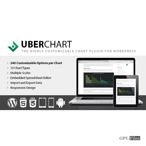
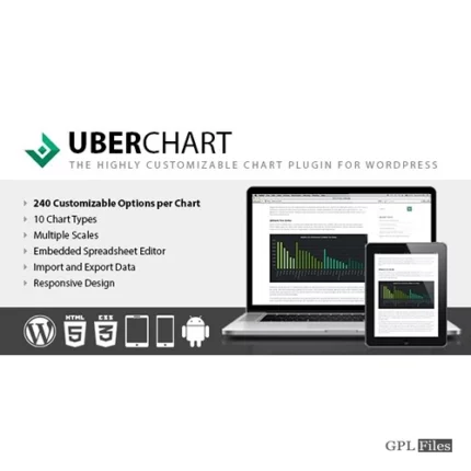
UberChart
Create your perfect chart
The following kinds of charts are available:
- Line Charts
- Area Charts
- Bar Charts
- Horizontal Bar Charts
- Pie Charts
- Doughnut Charts
- Radar Charts
- Polar Area Charts
- Scatter Charts
- Bubble Charts
Check out this snapshot of the Charts Menu with all the sections displayed to get a sense of the extraordinarily large number of possible possibilities. After selecting the chart type, you can then begin the customising process.
GENERAL OPTIONS
These choices are used to specify the overall behaviour of the chart as well as the appearance of certain of the chart’s features (datasets and scales each have their own customisation options; please refer to the respective sections for further information). For instance, you have the option to:
- Set the chart size, margin and background color
- Enable or disable the responsiveness of the chart
- Select the speed and the type of animation
- Set size, color, font family, font style and position of the chart title
- Set size, color, font family, font style and position of the text in the chart legend
- Set the style of the tooltips
DATASETS CUSTOMIZATION
You have complete discretion over how each individual datum should be shown on the chart; for instance, you can
- You may depict either straight or curved lines by defining the bezier curve tension of each line.
- Set the width of each line, make dashed lines with the distance between them that you want, then choose the lineCap and line.
- Combine the canvas settings of each individual line
- Adjust each point’s point style as needed (circle, triangle, rectangle, cross, line, star, dash and more)
- You may choose how each point should respond when the mouse is hovered over it; for instance, you can set the precise radius that responds to the hover mouse event.
- Adjust the size of each point or bubble, as well as its border and backdrop colour, using the sliders (in both hover and default status)
- You may choose the colour used for the backdrop and the border of each individual bar that is displayed in a bar chart (in both hover and default status)
- Change the colour of the backdrop and the border of each arc that is presented in a doughnut chart, polar area chart, or pie chart (in both hover and default status)
Models
The models in UberChart are specialised charts that can be put into the programme in order to immediately generate brand new charts. In other words, models are a method for reusing chart setups, which means that all that is required to get a result is to add the data points.
DEFAULT MODELS
This plugin comes pre-installed with 34 different default models, each of which enables you to quickly and simply build a different kind of chart without requiring you to spend any time on the initial setting. Watch this video if you want to learn more about the process of making a chart from a model.
Multisite Ready
This plugin can be used on a WordPress Network, and it supports both a Network Activation (in which the plugin will be activated on all the sites of your WordPress Network in a single step) and a Single Site Activation. A Network Activation is when the plugin is activated on all the sites of your WordPress Network in a single step (your plugin will be manually activated on single sites of the network).
Multilanguage Ready
The default languages for UberChart are English and Italian. If you wish to translate the plugin into another language, all you need to do is generate a translation file or manually translate it using a multilanguage plugin. UberChart is available in both of these languages by default.
High Quality Support
The creator of this plugin offers support for it directly by email in both English and Italian. Support is given in both languages. In the event that you run into any issues or want in-depth technical information on particular plugin components, you are in good hands here.








Reviews
There are no reviews yet.